ARCHOVIA
Brand Identity & Editorial Website for an Architecture Studio
In short
A complete identity and a brutalist, editorial website for an architecture and interior design studio — an isometric mark, a drafting-inspired visual language and a fast, scroll-driven site.
The live site
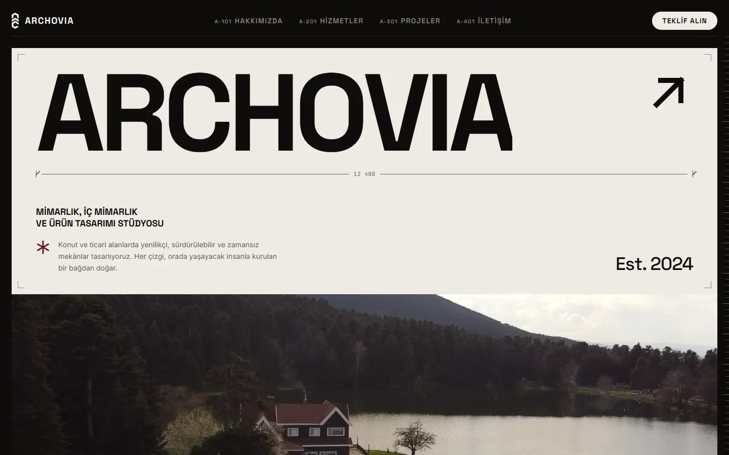
The identity
Stacked lockup 
Oxblood avatar 
Outline mark
The brand guide
The full identity, documented sheet by sheet: construction, colour, type, components and applications.
Showing 3 of 10 sheets
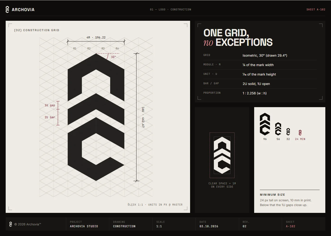
A-102 · Construction 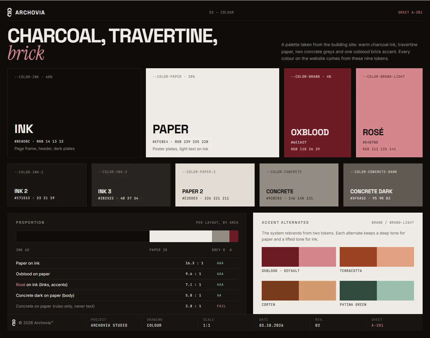
A-201 · Colour 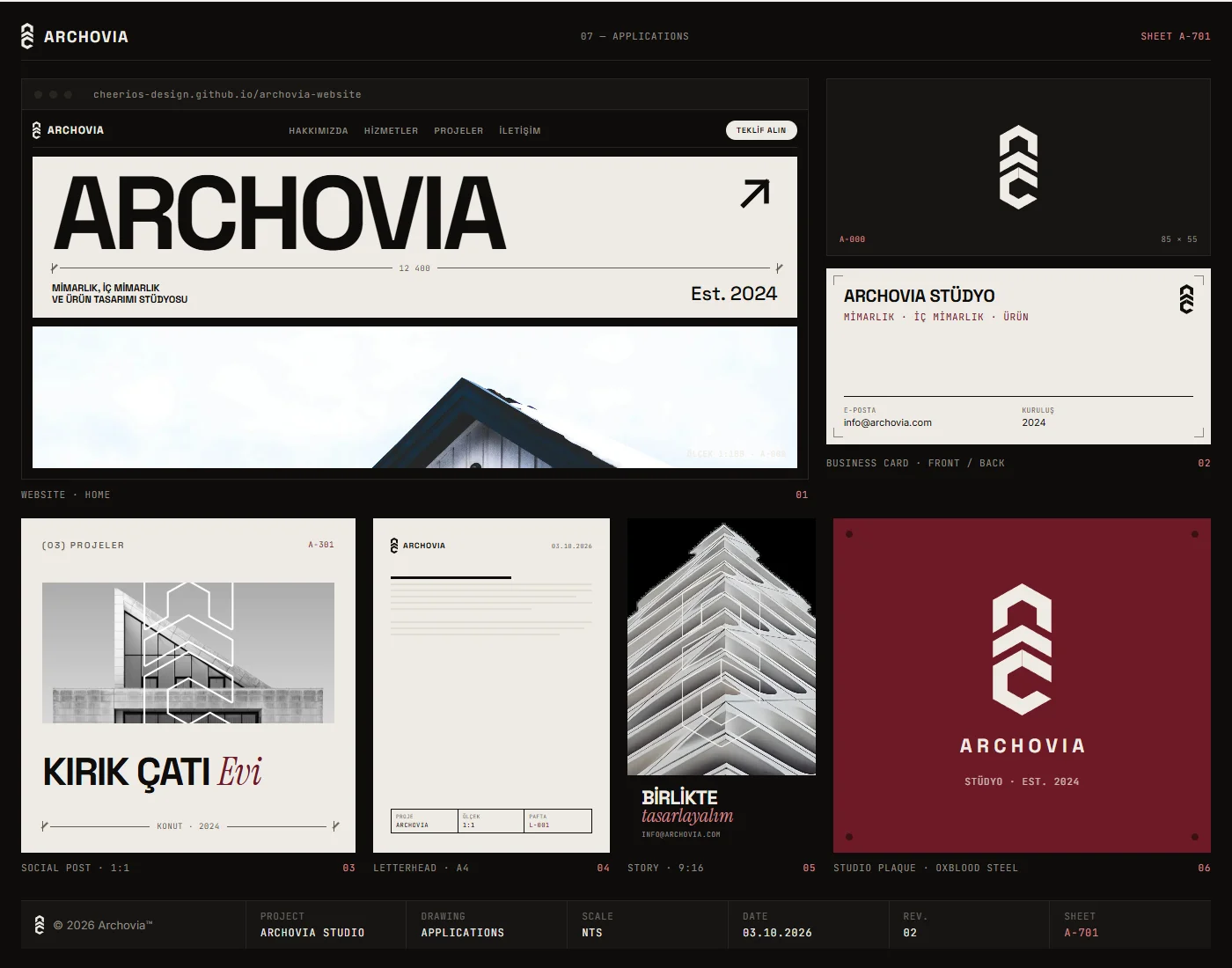
A-701 · Applications - All 10 sheetsView the full brand guide↗A large file. It reads best on a desktop screen.
The story
A Studio That Looked Like Every Other
Archovia was a young architecture, interior and product design studio with no consistent identity. Architecture studios sell with images, yet most of their websites look the same: a grid of photos and a contact page. Archovia needed a brand and a site that felt like the studio itself, precise, confident and crafted, without burying the work under effects or slowing it down.
Drawn on an Isometric Grid
I borrowed the language of the drawing board. The mark is built on an isometric 30° grid, stacked chevrons that read as both a roofline and an "A", with strict rules for clear space and minimum size. The palette is mostly ink and paper, with oxblood used sparingly as the accent, and four free typefaces cover display, body, a single italic accent word and measurements. On the website, each section is a poster-style "plate", and the details come straight from technical drawings: dimension strings, level markers, grid axes and a floor plan that draws itself as you scroll.
What the Studio Took Home
The studio received a full brand kit: logo, lockup and wordmark variants in SVG and PNG, an app icon and social avatar, design tokens and a ten-sheet identity guide covering construction, colour, type, components and applications. The site is built on Astro with Tailwind CSS, GSAP and Lenis and ships as static pages. Curtain page transitions and magnetic buttons give it a tactile feel, while responsive WebP images, videos that only play when visible and self-hosted fonts keep it quick, and every animation switches off for visitors who prefer reduced motion.
Kind words
“Working with Sam and Cheerio Studios was truly both enjoyable and easy. Sam managed the brand design and website design process beautifully, checking and testing everything multiple times. We wish him and his team continued success!”